robotmonkeys

the monkeys know all

Search results for: “people”

  • BarBot

    Categories: ,

    I’ve been strongly considering making a barbot (a.k.a. a drinkbot), even thought don’t usually drink at home. I haven’t given much thought to its cosmetics, instead I’ve been focusing on mechanics of the bot. I figure, the mechanics will dictate the form, and if one sprinkles enough LEDs on it, can look look fine.

    (more…)

  • Ron Jeremy’s Phone Book

    Categories:

    I just finished watching Porn Star: The Legend of Ron Jeremy. It’s a perfectly fine documentary, but didn’t really tell me anything I didn’t already know. Yes, Ron Jeremy is perhaps the most famous porn star. Yes, he doesn’t look like a porn star. Yes, he wants to be a mainstream actor. Yes, he’s beloved. All of this has been covered before. The one thing I did find interesting was Ron Jeremy’s “phone book.”

    He carries with him a binder of loose leaf paper that is haphazardly covered with names and phone numbers. It’s organized by location of the person recorded. In the film, he reveals that some of the pages are dedicated to:

    • New York City
    • Los Angeles
    • Other US locations
    • International
    • Radio Stations

    Now a guy keeping all of his phone numbers scribbled on pages in a binder isn’t that interesting, but what I did find interesting was that he linked various people in the together into a social graph. Different numbers are annotated with labeled arrows form one number to another. He uses this information to place the name and number in context. Now that is something I haven’t really seen before. Yes, Apple AddressBook.app &endash; and presumably others &endash; has the ability to to add fields like “spouse”, “friend”, and “child”, but these aren’t links, just additional text fields. It seems like allowing a user to to crawl their personal social graph might be a useful feature for address books. Even if it isn’t used often, it doesn’t necessarily add a lot of UI overhead.

  • Mobile Phone Keyboard Logger

    Categories:

    Two related links, both involving using your phone to shoulder surf your passwords. Both attacks take advantage of the fact that smart phones with accurate accelerometers are now ubiquitous. By monitoring the the vibrations of the phone, the attacks inver what keys were pressed on a keyboard. Both of these a much more proof of concept, than actual sophisticated attacks, but they are interesting none the less.

    At HOTSEC 11, Liang Cai and Hao Chen of UC Davis were able infer which key was pressed on an onscreen keyboard with 70% accuracy. By measuring how far phone was torqued around both the X and Y axises, the the location of where force was applied, and thus which key was pressed can be inferred. Cai and Chen made the task a bit easier for them. They held the phone in landscape mode, which spread the keys out more, thus causing a larger distribution of torques that could be measured. That’s not necessarily a problem since many people type in landscape mode. The bigger simplification was that they only looked at a touches on the dialing pad. A more interesting paper would have looked at attacking the alphabetical keyboard instead. I understand why they didn’t. The experiment was to find out if someone could use the accelerometers to read key presses at a high enough accuracy. Looking at their confusion matrix, I would think that determining alphabetical keyboard presses would need to be a two step solution. First, you’d get a distribution of what key was pressed. You’d then combine these presses with a Markov Chain language model to determine what the actual keyboard press was. “it was the durst of timez” becomes bit more Dickensian, a little less crappy rap-rock, and a lot less monkey.

    Of course, sniffing the phone’s keyboard is one thing, figuring out what someone is typing on their laptop or desktop is something else, but that’s exactly what
    Philip Marquardt and others at Georgia Tech did. In their work published at CCS 2011, they describe a technique where a phone placed next to keyboard read key presses via vibrations on the table at 80% accuracy. Unlike the method above, this team used a dictionary to increase the decoding accuracy. Their method feels the vibrations through the table and then attempts to categorize the key being on the left or right side of the keyboard (assuming the phone is placed to the left of the keyboard). Pairs of key presses are read, the distance between the first and second key of each pair is categorized as being either “near” or “far”. These triple are then passed through the dictionary in order to figure out what is the most likely English word typed. Left-right and near-far categorization is done using a neural net.

    via Security News Daily,
    ibidem

  • Discouraging Voters

    Categories: ,

    Emily Bazelon at Slate has written a short essay lamenting the fact that access to polls has become a partisan issue. In other words, the Republican Party is transparently engaging in widespread voter suppression.

    I will never understand why someone would not want to make it as easy as possible to let people vote. There’s something wrong if you’re in politics and you depend on an unengaged electorate.

  • Bento Curry Bathers

    Categories:

    Rice people with nori faces, bathing in curry.

    via Tokyo Mango.

  • NASA’s 3D Models

    Categories: ,

    Today I learned that NASA makes available for download 3d models of various spacecraft and ancillary equipment. Want a LEM? They got that. Want a a space shuttle? They have five. Vehicle Assembly Building? Launch Gantry? Crawler? Got it. Got it. Got it. Want an astronaut? Sure thing. Don’t want the whole thing? No problem.

    It’s pretty cool that NASA is making these available. I guess the original intention was for these models to be used for things like XPlanet or Celestia, but I discovered these through people are using these to print 3D models.

    3D printing is interesting, but it seems like most things that people are printing are just toys. Don’t get me wrong, part of me kind of likes the idea of printing toys for Maximilian, but it seems a hard to justify spending $1800 on a toy maker.

  • Stroop Effects

    Categories: ,

    Recently a group of us were laughing about how we could mess with children by teaching them the wrong names for colors. Just buy a Stroop Effect novelty poster, and pretend that nothing is wrong. Since the effect is because the language center of the brain is being stimulated in a way that is incongruent with the visual stimulus it takes longer correctly name the color shown.

    I then started to think about what would happen if you carried out the test with a bilingual person. Specifically, with people that are literate in languages that have completely different characters. I would think that if for example a monolingual speaker of language that used the Latin alphabet saw a word that was written with a completely different writing system, say Chinese, then the language center wouldn’t trigger since the character has no meaning to monolingual person. If the words were written in language that was sufficiently similar to the native language of the subject then the I would suspect that the language center would trigger and cause the effect, albeit at perhaps a lower intensity. Similarly, I suspect that the effect would have different intensities for someone that was bilingual, with the secondary language being less intense than the native language.

    Sufficiently curious, I set out test my hypothesis. I quickly coded up a bilingual Stroop Effect viewer and grabbed the most convenient monolingual person and the most convenient bilingual person I have access to and tried it out. While my test wasn’t very rigorous, it did satisfy my curiosity for the evening.

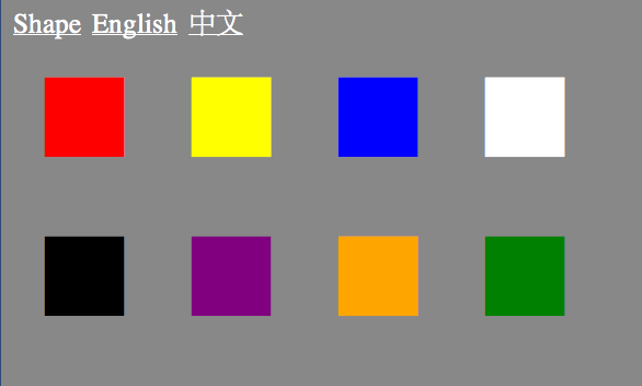
    The test was constructed so that the the subject was presented with eight colors (black, white, red, orange, yellow, green, purple, blue) in a random order in two rows of four. The color displayed were written in one of three different texts: language neutral squares, English, and simplified Chinese. The text was pulled from the name of the colors displayed. The text displayed in a random order and was guaranteed to not correctly correspond to the color it was written in. (e.g. The word “black” would never appear in the color black.) The subject advanced through each of the languages and as quickly and correctly as possible while saying aloud the color of the text each word appears in. Vocalization was to match the language the text was displayed in, or any language for the language neural text. Evaluation was conducted by comparing time to complete the task in each language, and expressing how difficult the task was in each language.

    While I do know some words in Mandarin, and can read some Characters including those for the colors red and white, I used myself for the monolingual-monoscript subject. The language-free shapes and the Chinese characters were by far the easiest and were about equal in difficulty. Since I was going quickly, I didn’t really have time to determine whether or not each character was one that I might know, and if so what its meaning was.

    I drafted Ming to serve as the bilingual-biscript subject. We both agreed that that there was an ordering in her time to complete and she said there was a definite ordering to the difficulty of the task. Again language neutral was the easiest, but for her English was the second easiest, and Chinese was the hardest. This makes sense because while she is literate in English and is very proficient in spoken English, her English is not at an equal level to her native Mandarin.

    Looking online, I found two references to bilingual Stroop effect tests, but neither were exactly like the one I tried. Reading only the abstracts, it appears that Ardila et al. 2002 looked at the effect in English/Spanish bilingual and monolingual persons. They found that bilingual persons were slower at identifying colors than monolingual users. Okuniewska 2007 seems to contradict in the previous study by saying that there was “a bilingual advantage”, but that bilingual persons didn’t perform equally well in both languages. Both of these studies were bilingual-monoscript subjects, what changing the writing between languages does is isolate the shape-to-language path in the brain.

    Personally, I find this experiment interesting, and it doesn’t seem like that it would take much to make this a proper experiment, but I wonder if anyone has actually done this test in psycholinguistics. I guess I need to ask around.

    UPDATE: Sat Jul 14 11:20:15 PDT 2012:
    I found a paper that closely mimics what I was trying to test, but not exactly. In 1978, Biederman and Tsao compared monolingual English speakers to bilingual Chinese speakers. They found that Chinese characters were harder to process than than Latin characters. The did not look at difference in textual representation, but rather simply referred to previous bilingual tests that used the Latin alphabet for both languages. They speculate that Chinese is harder to process for even native literate speakers since the characters do not carry any pronunciation information in them. While that is true, it seems like repeating this two alphabets would be needed to confirm.

    Al-Ghatani et al. in 2010 created an Arabic Stroop test and applied it to bilingual subjects. Ten bilingual participants were given both an English and an Arabic version in order to measure the how similar the Arabic test is to the English test.

    Ingraham et al. in 1988 created a Hebrew version of the Stroop test, but appears to have tested Hebrew.

    Other related work:

  • Birthday Distribution

    Categories:

    Using census data, the New York Times posted a table of birthday distributions in the United States for people born between 1973 and 1999. The Daily Viz then turned the table into a heatmap with the colors indicating the order of the birthdays, not their likelihoods. If you look at number of births in each month, or number of births per day in each month, the results are much flatter. Still the bias towards the summer shows up.

    I’m not surprised that birthdays aren’t uniformly distributed. I am a bit surprised that they’re biased towards the summer though. I would have thought that any bias that long cold nights brought, would have long disappeared with the advent of artificial lights, heat, and a move from an agrarian economy. I’d also like to see a similar charts for other countries. I suspect that if the bias is towards summer months, we’d see a six month shift in southern hemisphere nations.

  • Brand New Hates Helvetica

    Categories:

    This reminds me of Paula Scher in Helvetica saying that Helvetica was the font of the Vietnam War.

    Why I hate Helvetica

    As it concerns identity design we all recognize Helvetica as a bastion of the rise of the practice of corporate identity in the 1960s, deployed with unrelenting passion by the likes of Massimo Vignelli and Unimark in the U.S. and Total Design in Europe. It helped shed decorative logos and present a unified front for corporations of all sizes in the most serious of manners. It was, in a way, a unifying technology of the era, establishing a specific standard for how logos should look. And that’s my biggest issue with Helvetica: It’s 1960s technology, 1960s aesthetics, 1960s principles. You know what else is technology from the 1960s? Rotary-dial telephones. The BASIC computer language. Things we’ve built on for the past 50 years and stopped using as the new, more functional, more era-appropriate products took hold. Today there are dozens of contemporary sans serif typefaces that improve the performance and aesthetics of Helvetica but yet some designers still hold on to it as if it were the ultimate typeface. It’s not. Just because it’s been glorified in a similar way as the suits and clothing in Mad Men doesn’t mean it’s still the right choice. You don’t see people today dressed like Don Draper or Lane Pryce — the business-person equivalents of a business typeface — because fashion has changed, attitudes have changed, the world has changed. But, like cockroaches, Helvetica seems to be poised to survive time and space, no matter what. When you see someone walking down the street, today, dressed like a 1960s business person, you (or at least I) think “what a douche.” That’s the same thought I have when I see something/someone using Helvetica.

    The main argument of using Helvetica is that it’s “neutral.” That is absolute bullshit. There is nothing neutral about Helvetica. Choosing Helvetica has as much meaning and carries as many connotations as choosing any other typeface. It has as many visual quirks as any other typeface it was meant to shun for needless decoration. Helvetica is the fixed-gear bike of typefaces: it’s as basic as it gets, but the statement it makes is as complex as anything else. Standing for independence and going against the grain, supposedly not caring about what others think or of being duped for the upgrades and improvements that “the man” forces upon us. Helvetica is old. Helvetica is clunky. No business, service, or product deserves Helvetica in the twenty-first century more than anyone deserves to sit in a dentist chair in the 1960s.

    I agree that it’s absurd to say that Helvetica is “neutral” since nothing is truly neutral, especially given its history as essentially the stylish least-common denominator. The politically correct font if you will. I also agree that fetishizing the past is lazy. Max Miedinger and Eduard Hoffmann aren’t some sort of demigods. However, there’s something ironic and a bit pathetic about wanting modernity and advancement in typography of all things. It’s a field that’s based on copying or slightly tweaking existing work. Helvetica? 1896’s Akazidenz Grotesk. Garamond is from the mid 16th century. Some serif fonts can trace their lineage back to illuminated manuscripts, so claiming that designers shouldn’t use a 50 year old font because it’s dated falls flat.

  • “Don’t Worry. Your Data is Safe.”

    Categories: ,

    I took my laptop to the Apple Store to get it repaired. (The keyboard doesn’t work.) After explaining to the guy at the store, he starts taking down my contact info. When he’s done, he says. “And what’s your username and password? Don’t worry. Your data is safe.”

    Aghast, I say “But my data is NOT safe if I give you my password!*

    “Uhh….”

    “Can’t you just boot off an external drive or something?”

    “Well, umm… yeah, but this is how that prefer we do it.”

    Sure enough, the Apple form has blanks for username and password.

    In the end, I gave them Ming’s password, because really it didn’t matter. I was giving a perfect stranger an unencrypted drive. It does make me think though. After decades of telling users not to share they’re passwords. Not to give them to people saying they’re from IT. Not to trust anyone with your password, Apple is undoing this as part of standard operating procedure. Or maybe I’m just old, and I’m supposed to think of Apple as a parent.†

    * Yes, I recognized the naivete of believing a simple password provided adequate security in this situation.

    †My parents never read my stuff. I see no reason to read my child’s.